Vehicle Service Mobile App User Testing
IBM Consulting Client Engagement
Role
UX Consulting Intern
Team
6 UX designers & researchers
Duration
3 months
Outcomes
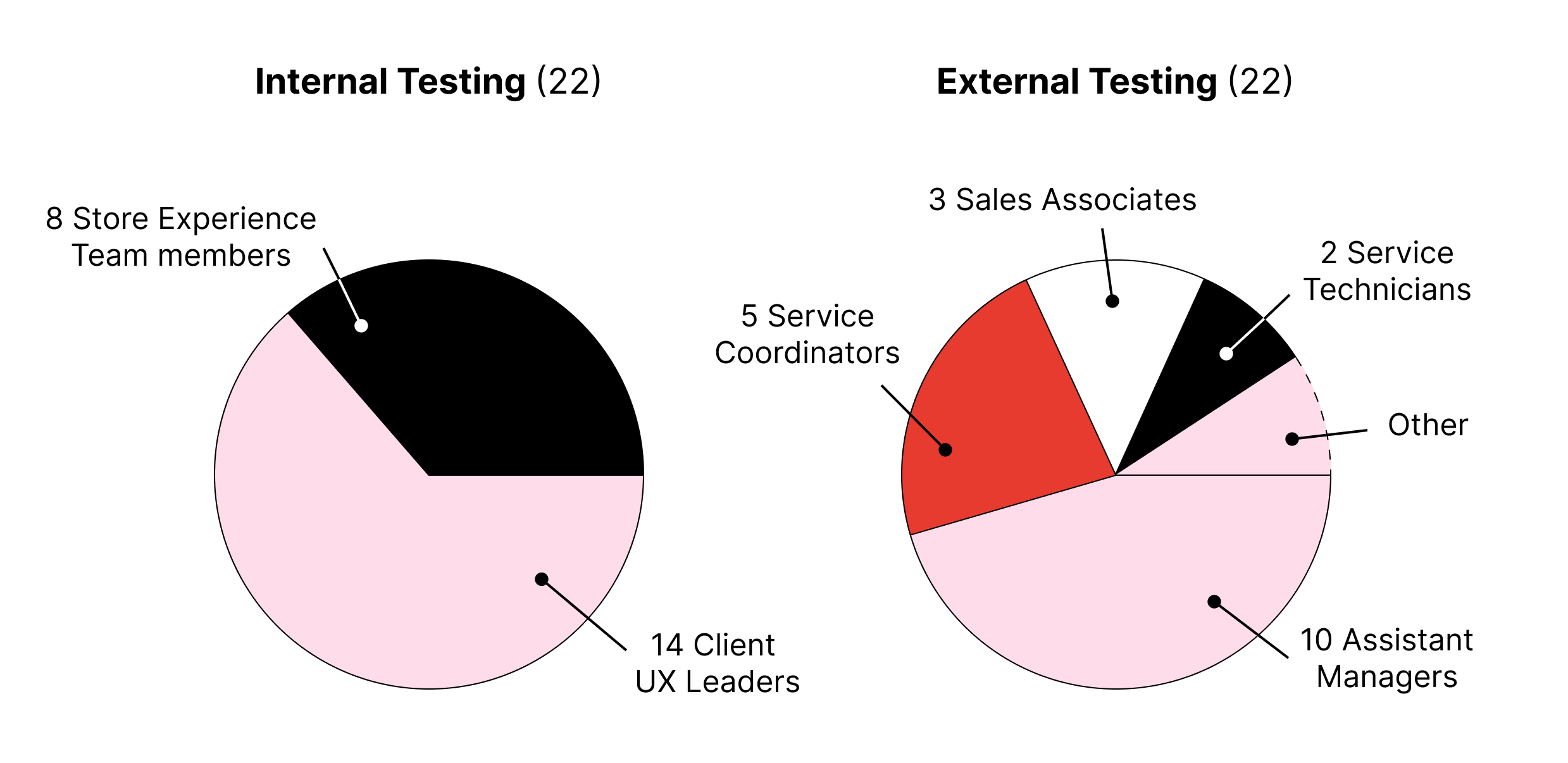
Client deliverable with research and findings from mobile app user testing with 44 users.
Client Devon is a company that provides vehicular services and works with IBM consultants on multiple work streams to create a new and improved mobile experience for the store employees that work at their physical stores across the United States.
The Project
Client Devon is working to turn their segmented, outdated, and convoluted employee experience into a mobile application that:
Streamlines store employee workflow onto one platform
Integrates dense information like work order, backroom, customer appointment, and payment in a way that is easily navigable
Provides an experience that is more efficient and productive than the existing workflow
Can be easily introduced to employees across the country
My Task
Through user testing, evaluate the mobile application’s success in meeting goals, identify necessary refinements, and articulate the product’s value to client stakeholders.
Test Design
Timeframe: July 10 – 28, 2023
Methodology: Unmoderated Remote Testing
Unmoderated in order to test the application’s intuitiveness
Prototype interactions limited to correct clicks only, to avoid participants getting lost while unmoderated
Participants evaluated based on number of clicks and time spent
Test contained prototype tasks and reflective questions
Participants
Store Experience Team: Corporate representatives with prior store experience
The User Test
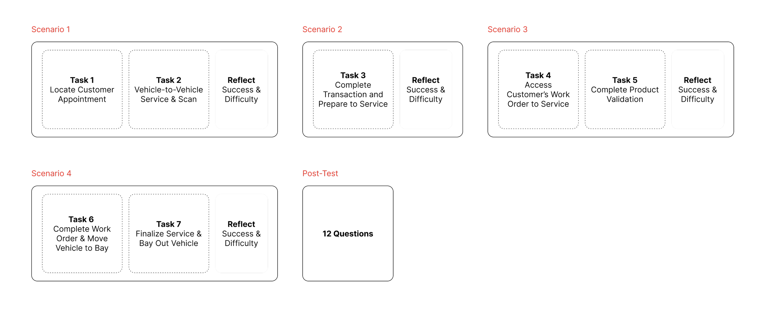
The user test is comprised of 4 scenarios multiple tasks, each addressing a key use case in a store employee’s day-to-day tasks. My first work as an intern involved helping the UX team prepare the test scenario screens such that there were no prototype errors to confuse a test participant.
Example prototype flow for one test scenario:
Data Collection
During user tests, my team and I were able to observe patterns in participant errors and form insights on the design flaws causing these errors.
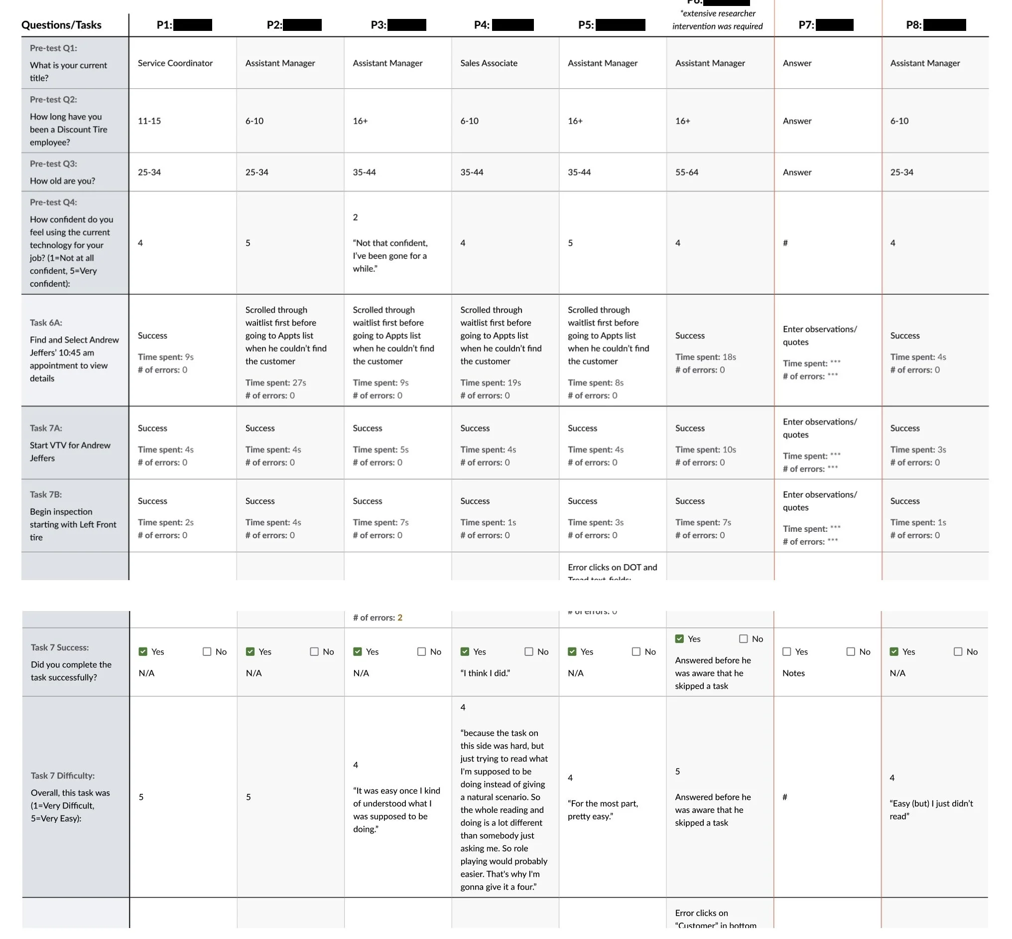
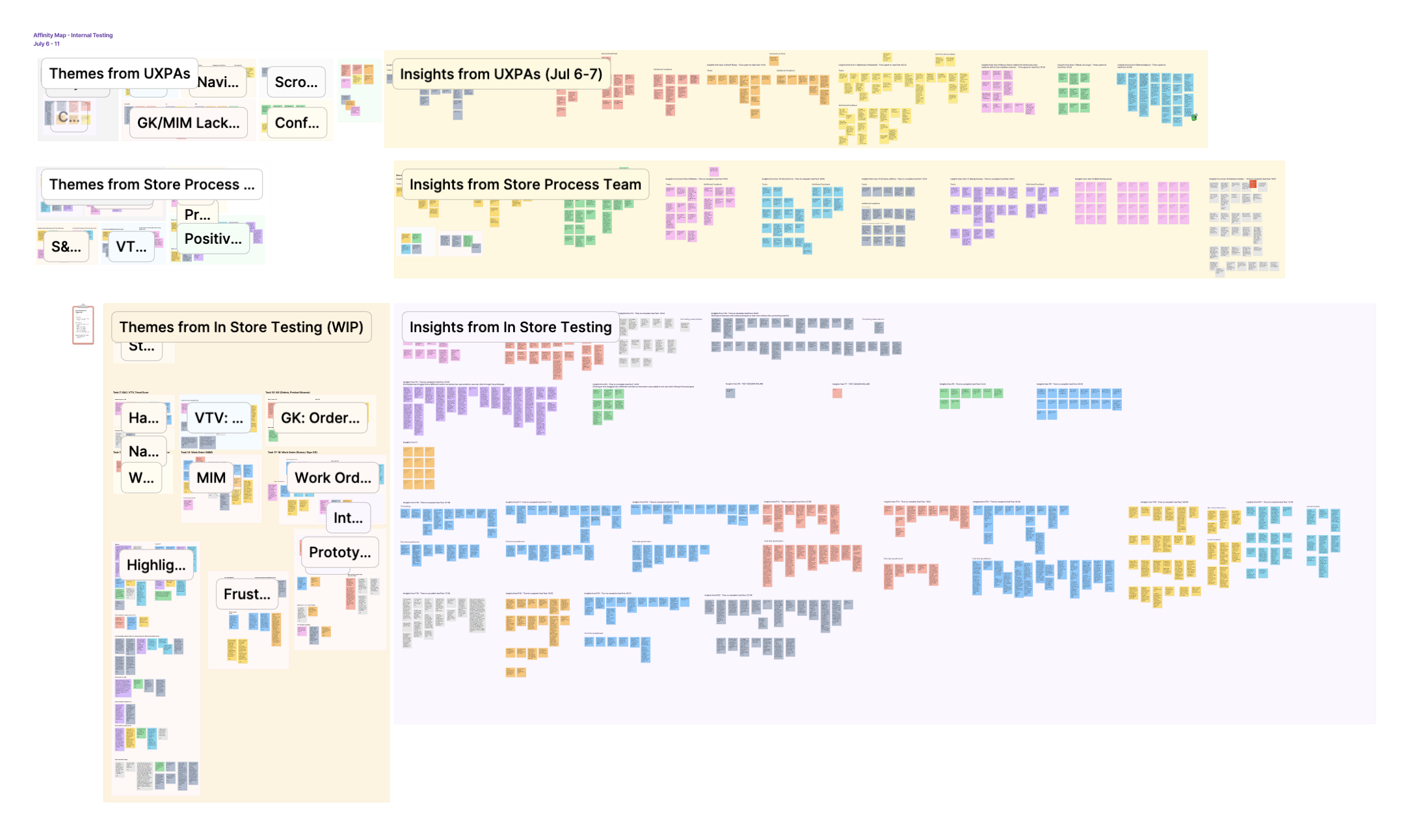
Affinity mapping and data tables were used to help measure product success and inform next steps for refinement.
Visualization of Participant Observation
1. Affinity Mapping
The Affinity Map captures observations made by the UX team during participant tests. These observation were then organized into themes for analysis. I developed my research skills and ability to draw actionable insights from observations.
2. Data Table
Pre-Test (i.e. Employee experience, demographic information)
Observations
Error click counts
Time spent on tasks
Reflection responses
Post-Test
Synthesis & Analysis
Negatives
Sometimes the large quantity of information presented can make navigation or next steps unclear.
Convoluted visual indicators sometimes caused confusion on interactive versus non-interactive elements.
Various calls to action and interactive options can reduce confidence in using the app “correctly”.
Some participants expressed worries about lag or connectivity when relying on a mobile app.
Positives
Participants reported user-friendly mobile experience that does not require training.
Participants liked and were impressed by the ability to access and move between so many different kinds of information.
Participants felt the mobile app would integrate smoothly into their existing day-to-day experience.
Participants thought the app would improve their workflows by eliminating inconveniences like running to a computer.
Overall,
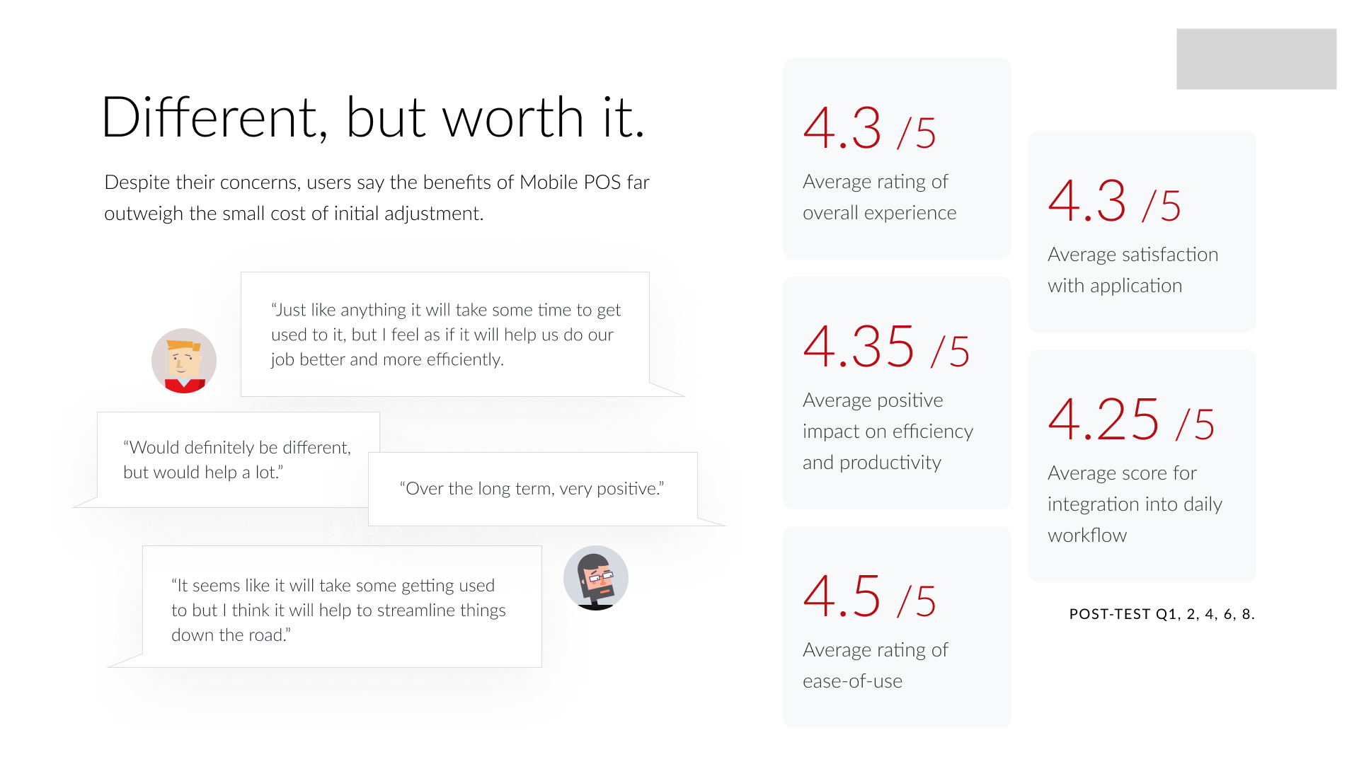
Participants felt the app intuitively integrated and improved their workflow experience.
But, we found that the information-heavy nature of the service workflow necessitated detailed refinements of visual indicators that clarify navigation or actions.
My team prepared a research slide deck to demonstrate the value of the new mobile application to Devon’s team and pinpoint areas for improvement. A few slides I created are shown below.


